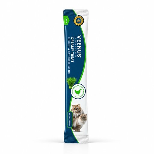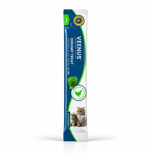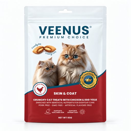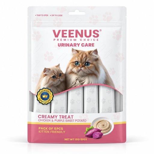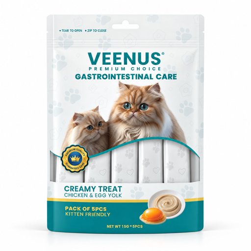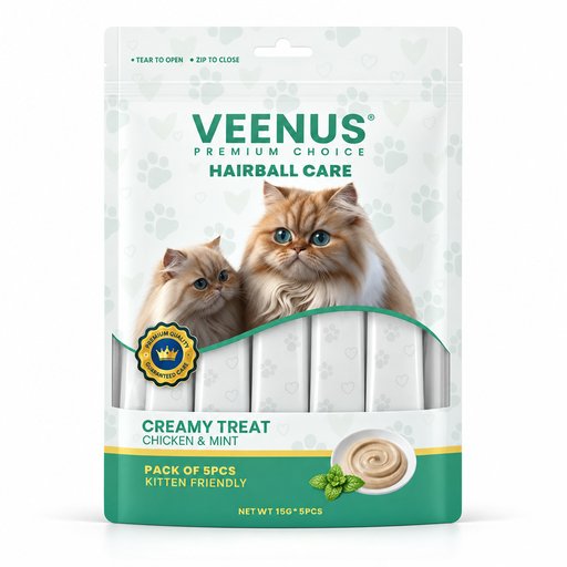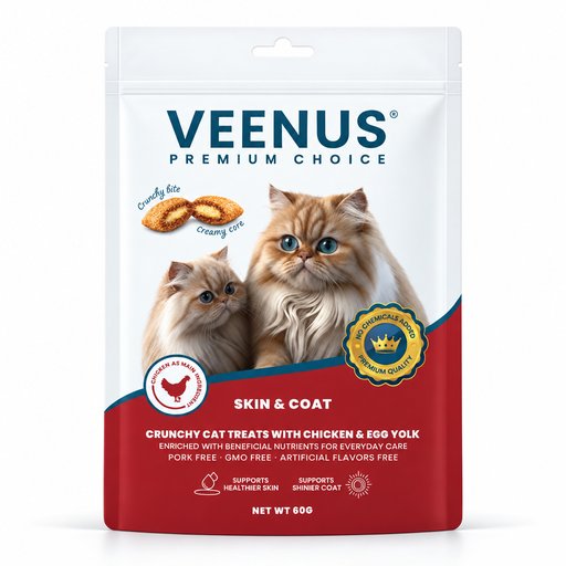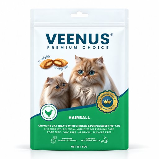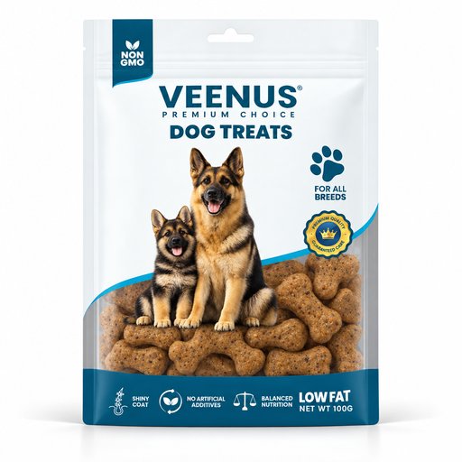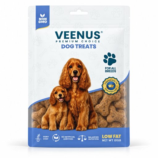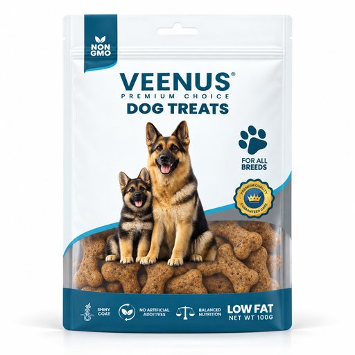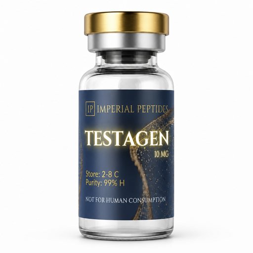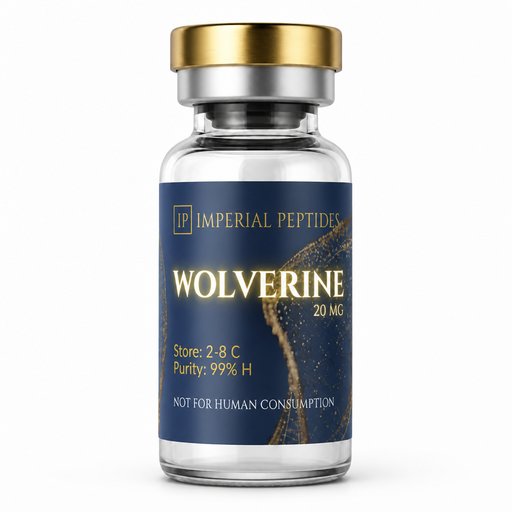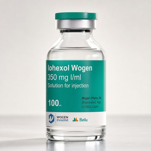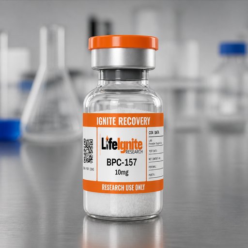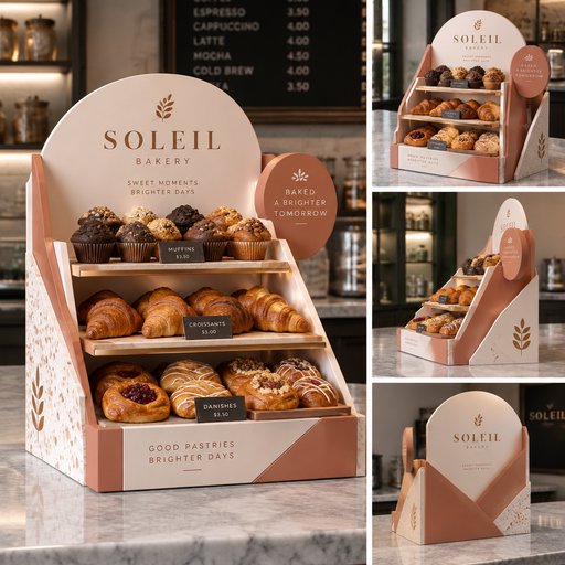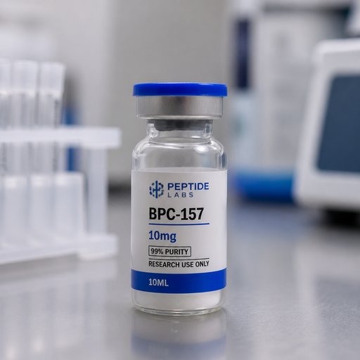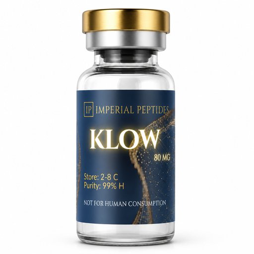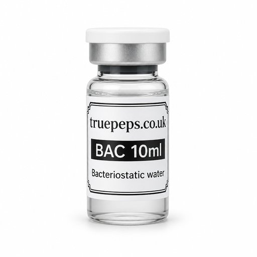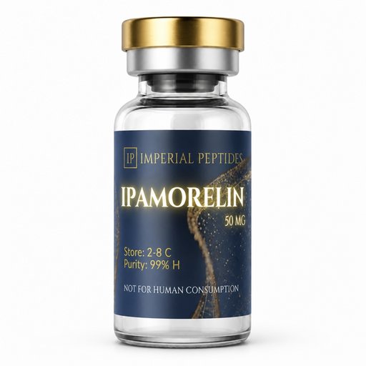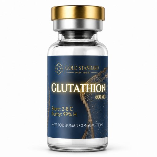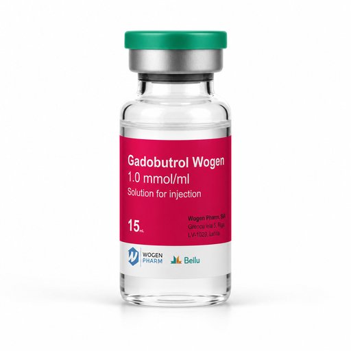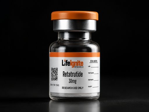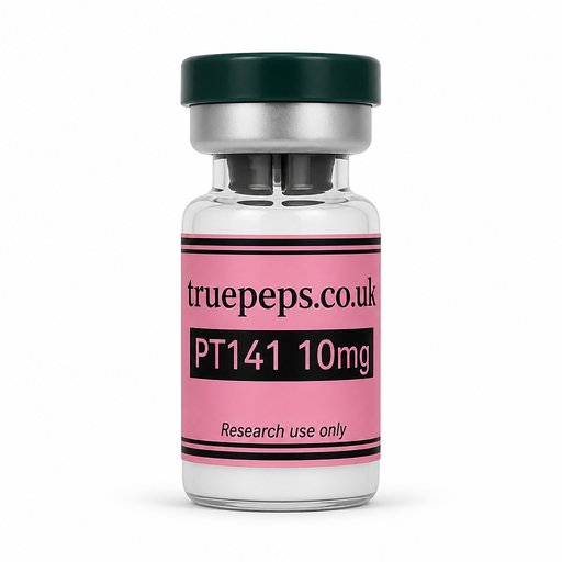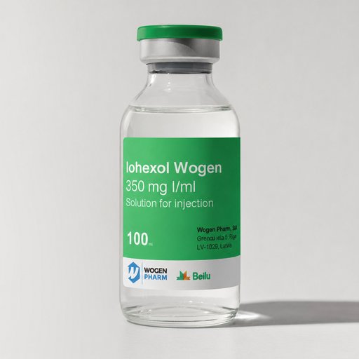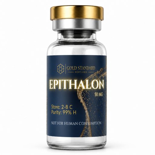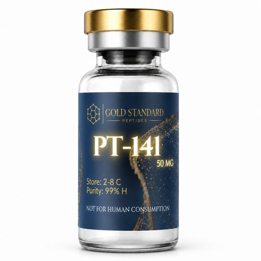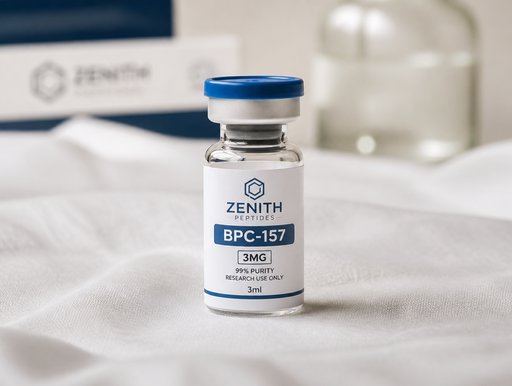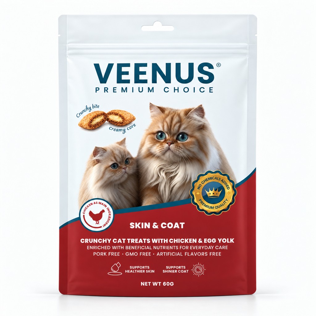
AI-generated mockup
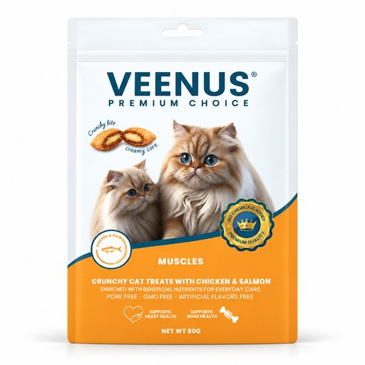
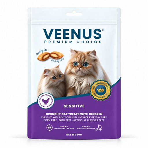
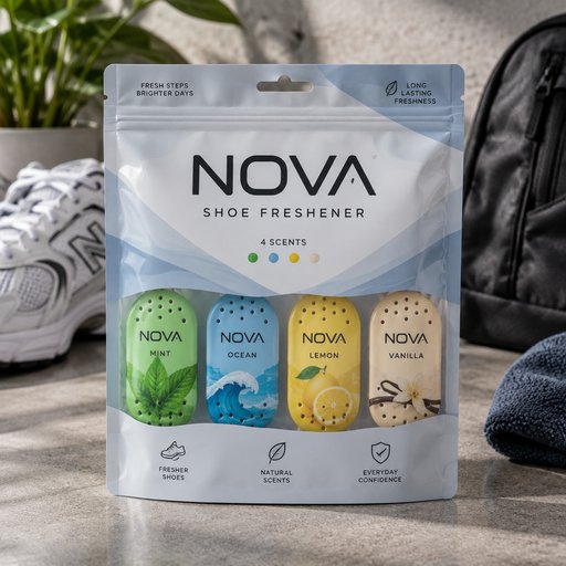
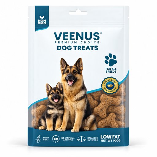
Create a premium, photorealistic, high-resolution studio product image using the uploaded Image 1 as the exact product reference. DO NOT CHANGE THE COLORS AT ALL. The final result must look like a professionally retouched e-commerce and catalogue product photograph: perfectly straight, smooth, clean, realistic, premium, and ready for commercial use. IMAGE REFERENCE PRIORITY IMAGE 1 — ABSOLUTE PRIMARY REFERENCE Image 1 is the EDIT TARGET and the absolute primary reference for the packaging. Use Image 1 EXACTLY for: All colors Light/pale colors Shades and tones Gradients Artwork Branding Logo Typography Patterns Graphic elements Packaging shape Structure Proportions Dimensions Seals Edges Cut-outs Hanging holes Labels Margins Spacing Overall visual identity THE COLORS OF IMAGE 1 MUST BE REPRODUCED EXACTLY. This is extremely important: DO NOT brighten, darken, saturate, desaturate, warm up, cool down, or otherwise modify ANY color from Image 1. In particular, preserve the very light/pale colors exactly as they appear in Image 1. Do not make the light colors more saturated, darker, whiter, greyish, beige, yellowish, or otherwise different. PRODUCT PRESENTATION Show one complete product/package only. Position it perfectly upright and precisely front-facing. Center it horizontally and vertically. Make it level, balanced, and symmetrical. Preserve the exact packaging shape, silhouette, dimensions, edges, seals, cut-outs, hanging holes, and structural details from Image 1. Correct the camera angle and perspective so the product appears professionally photographed straight-on. Leave generous and evenly distributed empty space around the product. Do not crop any part of the packaging. Do not tilt or lean the packaging. Do not use a three-quarter angle. The packaging must look naturally manufactured and realistic — not inflated, pillow-like, distorted, or artificially reshaped. PACKAGING SURFACE — CRITICAL Make the front of the packaging perfectly smooth, flat, taut, clean, and evenly presented. Remove the folds completely. Remove all: Folds Wrinkles Creases Dents Bulges Ripples Waves Crumpled areas Uneven reflections Surface distortions Warping Sagging Excessive plastic deformation The packaging should look as though it has been professionally flattened and prepared for a premium catalogue product photograph. The surface must appear perfectly smooth and controlled, while still remaining physically realistic and naturally manufactured. OPENING AREA Keep only a very small, subtle natural fold/crease at the actual bag opening, if visible in the reference. Do NOT place folds on the top/front body of the bag. The main body of the packaging must remain completely smooth and flat. Do not create artificial wrinkles or folds anywhere else. FINISH & LIGHTING Use a clean matte-to-satin finish with only extremely subtle and controlled highlights. The lighting should resemble a professional high-end studio product photograph. Use: Soft, even studio lighting Clean exposure Natural dimensionality Very subtle realistic shadows Controlled highlights Neutral white studio background Do not add: Visible plastic texture Grain Fabric texture Leather texture Embossing Artificial surface texture Excessive gloss Harsh reflections Dramatic shadows Cinematic color grading The product should look premium, clean, minimal, realistic, and commercially photographed. ARTWORK PRESERVATION — ABSOLUTE Preserve the supplied product design exactly as provided in Image 1. Keep completely unchanged: Brand logo Product name Typography All written information Product photographs Illustrations Icons Symbols Colors Gradients Patterns Graphic elements Artwork proportions Margins Spacing Flavor information Net weight Label placement Packaging proportions The complete artwork must appear: Flat Sharp Correctly aligned Undistorted Professionally printed Fully readable where visible Do not redesign, regenerate, rewrite, simplify, stretch, compress, curve, move, crop, replace, or reinterpret any part of the artwork. Do not invent missing details. COLOR ACCURACY — CRITICAL IMAGE 1 IS THE COLOR MASTER. The final image must preserve the exact colors of Image 1. Do not apply any: Color grading Cinematic grading Warm tint Cool tint Contrast color shift Saturation adjustment Desaturation Brightening of pale colors Darkening of pale colors Hue changes White-balance color shifts Every color must remain visually identical to Image 1. Pay particular attention to the extremely light and pale areas of the original packaging. They must remain exactly as light, soft, and subtle as they appear in Image 1. FINAL IMAGE REQUIREMENTS The final result must look like a real professional studio photograph of the exact same packaging from Image 1, only cleaned up and professionally presented. The packaging should be: Straight + Front-facing + Centered + Smooth + Flat + Taut + Undistorted + Clean + Sharp + Photorealistic + Premium. Keep the original packaging design and colors 100% faithful to Image 1. Do not alter the product design. Do not change the colors. Do not redesign anything. The only significant modification should be the professional photographic presentation and complete removal of unwanted folds, wrinkles, creases, dents, bulges, ripples, and surface distortions, while keeping only a tiny natural fold at the actual opening of the bag if necessary for realism.
September 15, 2026
More packaging mockups