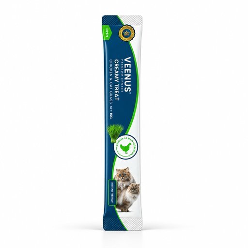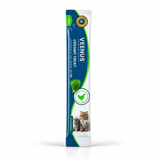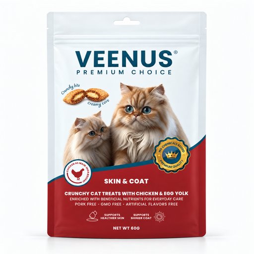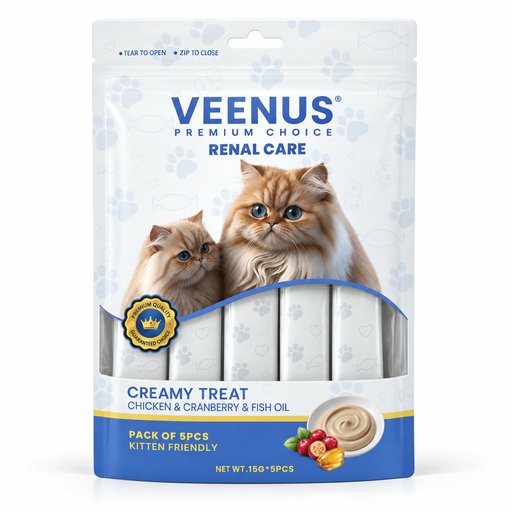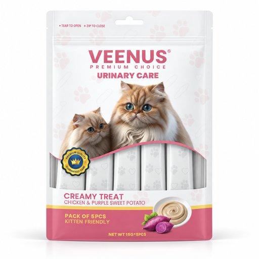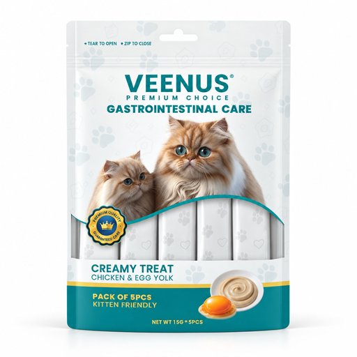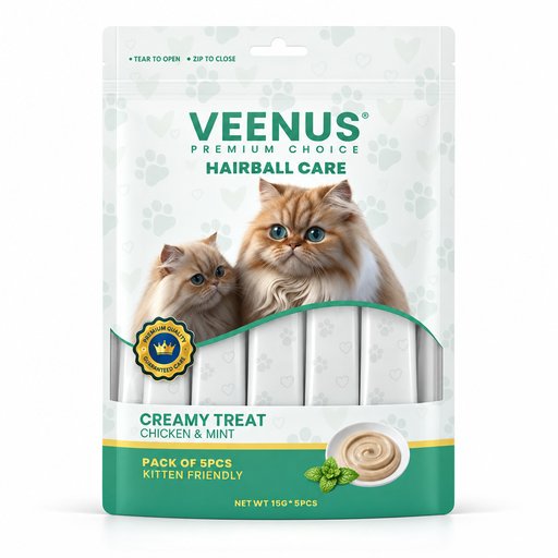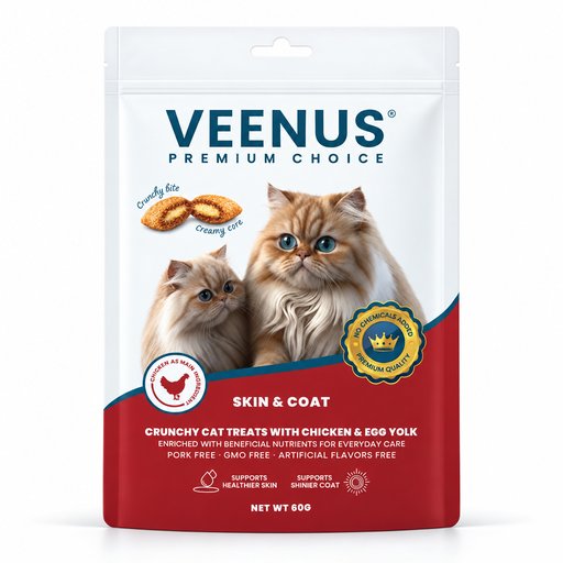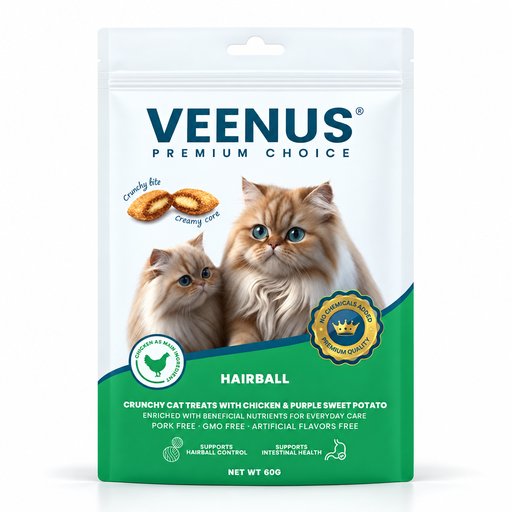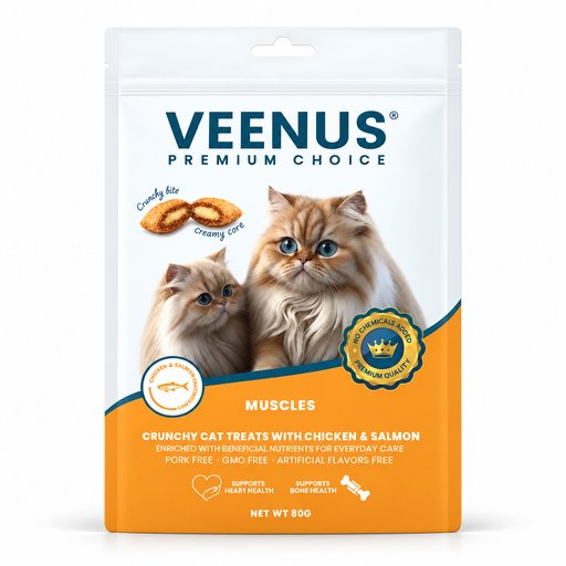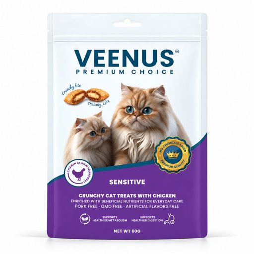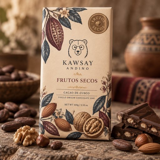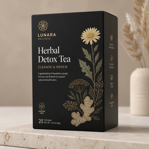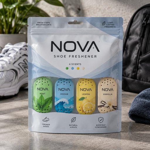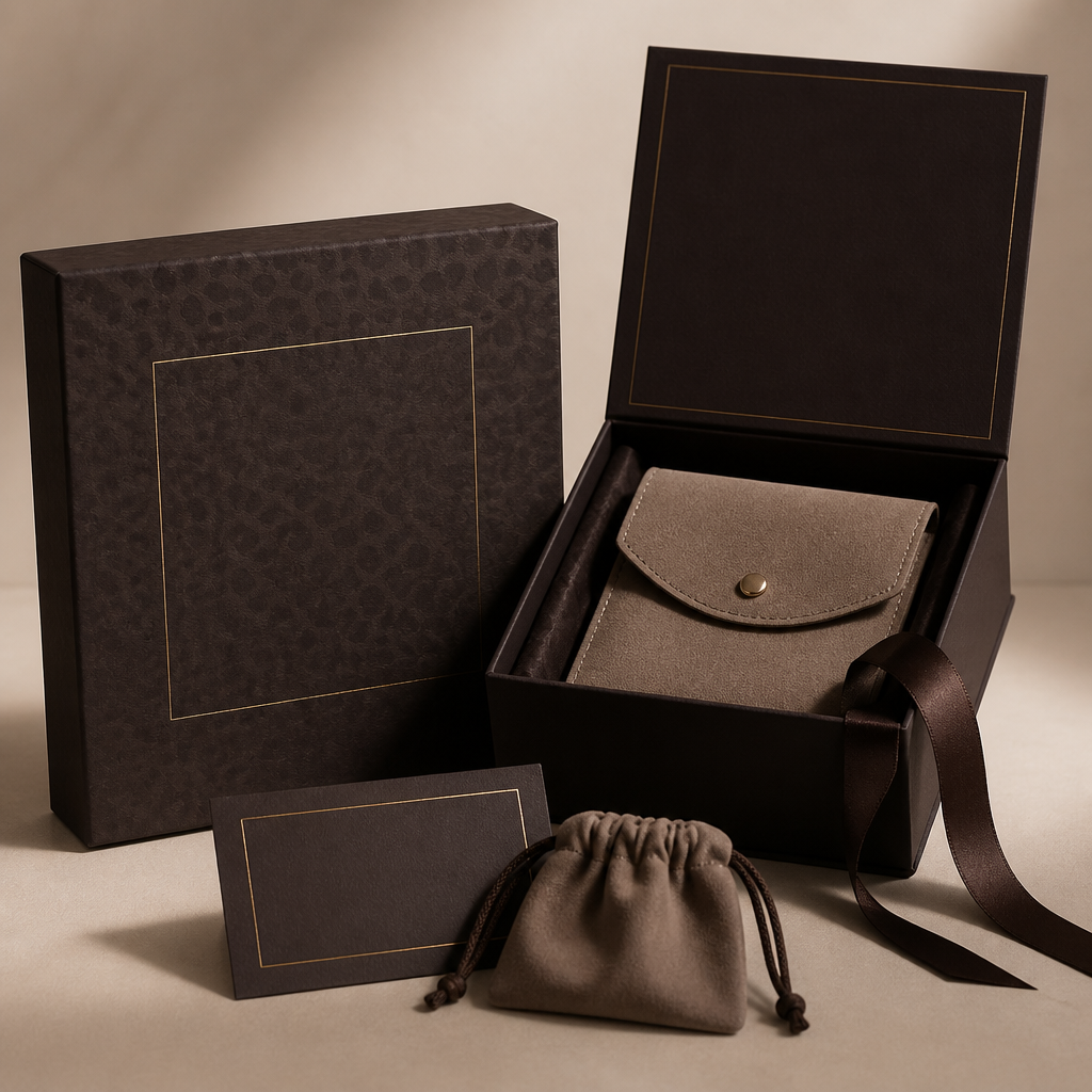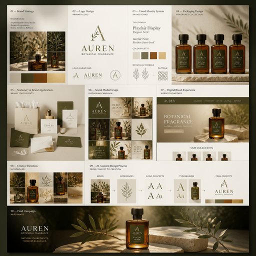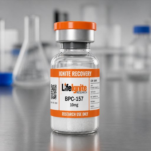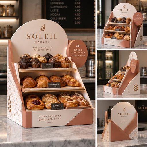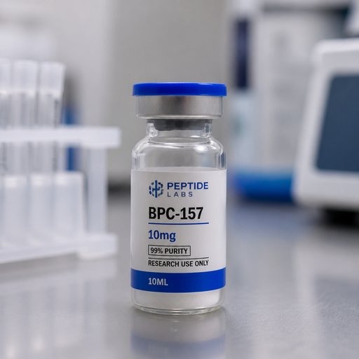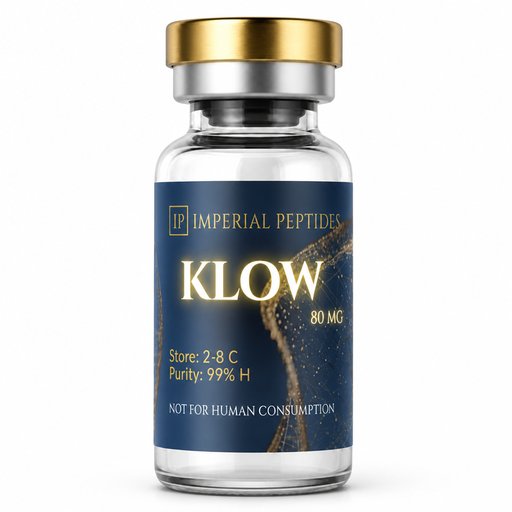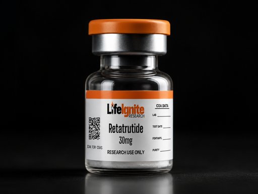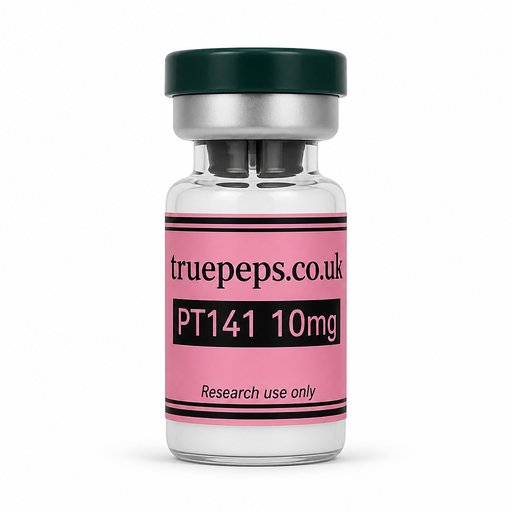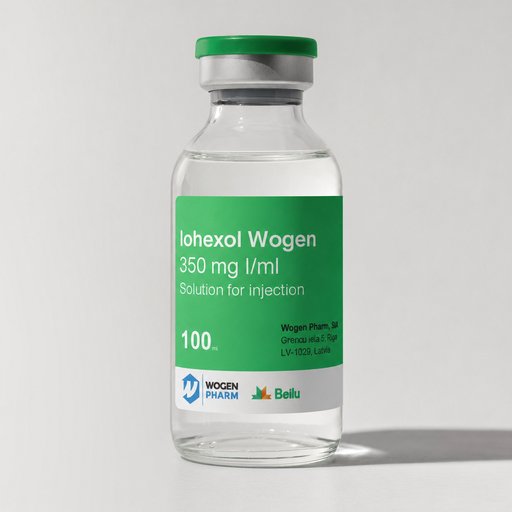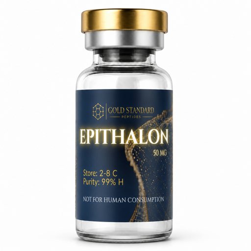
AI-generated mockup
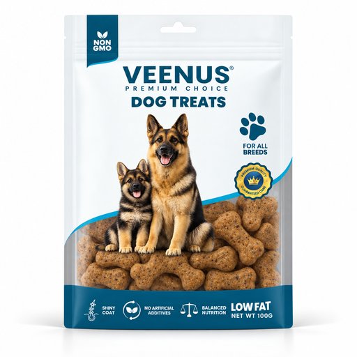
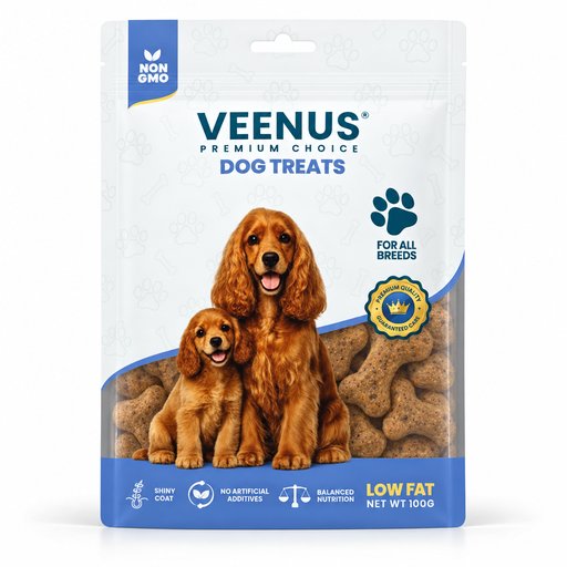
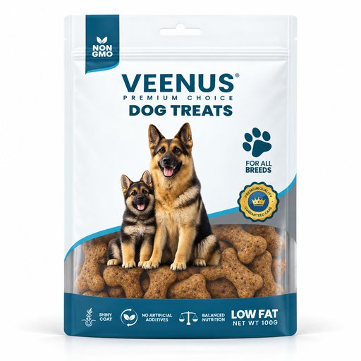
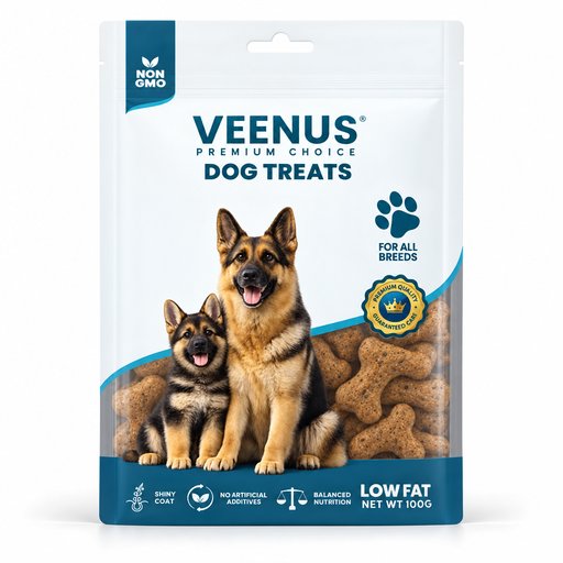
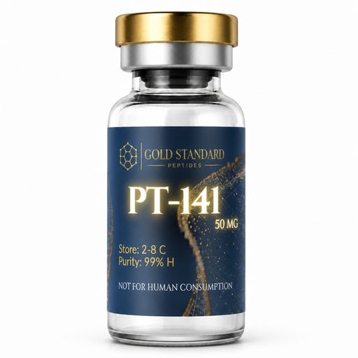
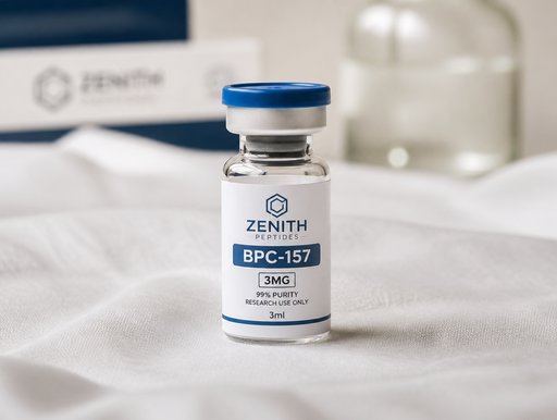
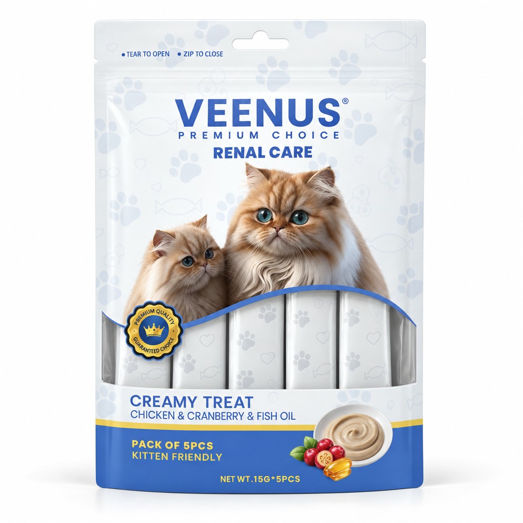
Create a **premium, photorealistic, high-resolution studio product image** using the uploaded images/files as exact product references. **DO NOT CHANGE THE COLORS AT ALL.** The final result must look like a professionally retouched **e-commerce and catalogue product photograph**: perfectly straight, smooth, clean, realistic, premium, and ready for commercial use. ## IMAGE REFERENCE PRIORITY There are three reference images, and each has a different role: ### IMAGE 1 — ABSOLUTE PRIMARY REFERENCE **Image 1 is the EDIT TARGET and the absolute primary reference for the packaging.** Use Image 1 EXACTLY for: * All colors * Light/pale colors * Shades and tones * Gradients * Artwork * Branding * Logo * Typography * Patterns * Graphic elements * Packaging shape * Structure * Proportions * Dimensions * Seals * Edges * Cut-outs * Hanging holes * Labels * Margins * Spacing * Overall visual identity **THE COLORS OF IMAGE 1 MUST BE REPRODUCED EXACTLY.** This is extremely important: **DO NOT brighten, darken, saturate, desaturate, warm up, cool down, or otherwise modify ANY color from Image 1.** In particular, preserve the **very light/pale colors exactly as they appear in Image 1**. Do not make the light colors more saturated, darker, whiter, greyish, beige, yellowish, or otherwise different. ### IMAGE 2 — INTERNAL PRODUCT REFERENCE Use Image 2 **ONLY** as the reference for the actual product pieces that will be placed inside the packaging. Place **5 pieces of the Image 2 product inside the bag**, at a realistic and proportional scale. ### IMAGE 3 — STYLE / PRESENTATION REFERENCE ONLY Use Image 3 **ONLY as a reference for the style, structure, and presentation of the bag**. Image 3 must NOT be used as a reference for: * Colors * Artwork * Graphics * Patterns * Branding * Typography * Visual identity **Do NOT copy any colors from Image 3.** The final bag should have the **presentation/style of Image 3**, but the **exact colors and complete design of Image 1**. --- # PRODUCT PRESENTATION Show **one complete product**. * Position it perfectly upright and precisely front-facing. * Center it horizontally and vertically. * Make it level, balanced, and symmetrical. * Preserve the exact packaging shape, silhouette, dimensions, edges, seals, cut-outs, hanging holes, and structural details. * Correct the camera angle and perspective so the product appears professionally photographed straight-on. * Leave generous and evenly distributed empty space around the product. * Do not crop any part of the packaging. * Do not tilt or lean the packaging. * Do not use a three-quarter angle. The packaging must look naturally manufactured and realistic — **not inflated, pillow-like, distorted, or artificially reshaped.** --- # TRANSPARENT GREY AREA The **grey section on the first bag in Image 1 must be completely TRANSPARENT**. It must function as a realistic transparent packaging window. **Do NOT render this area as grey, opaque, white, frosted, or semi-opaque.** Through this transparent section, place **5 pieces of the product from Image 2 inside the bag**. The 5 pieces must: * Be correctly scaled relative to the bag. * Be naturally arranged inside the packaging. * Look physically contained inside the bag. * Have realistic depth and positioning. * Be proportional to the actual packaging. Position the 5 pieces so that **only their pattern/visual appearance is visible through the transparent window**. The **text, labels, and unnecessary details on the internal products should be hidden by their positioning and scale**, similar to the visual effect shown in Image 3. Do not allow the internal products to look oversized or unrealistic. --- # PACKAGING SURFACE Make the front of the packaging perfectly smooth, flat, taut, and evenly presented. Remove all: * Folds * Wrinkles * Creases * Dents * Bulges * Ripples * Waves * Crumpled areas * Uneven reflections * Surface distortions The packaging should look professionally prepared and perfectly positioned for a premium catalogue photograph. Use a clean **matte-to-satin finish** with only extremely subtle and controlled highlights. Do not add: * Visible plastic texture * Grain * Fabric texture * Leather texture * Embossing * Artificial surface texture --- # ARTWORK PRESERVATION Preserve the supplied product design **exactly as provided in Image 1**. Keep completely unchanged: * Brand logo * Product name * Typography * All written information * Product photographs * Illustrations * Icons * Symbols * Colors * Gradients * Patterns * Graphic elements * Artwork proportions * Margins * Spacing * Flavor information * Net weight * Label placement * Packaging proportions The complete artwork must appear: * Flat * Sharp * Correctly aligned * Undistorted * Professionally printed * Fully readable where visible **Do not redesign, regenerate, rewrite, simplify, stretch, compress, curve, move, crop, replace, or reinterpret any part of the artwork.** Do not invent missing details. --- # COLOR ACCURACY — CRITICAL **IMAGE 1 IS THE COLOR MASTER.** The final image must preserve the **exact colors of Image 1**. Do not apply any cinematic Remove all: * Folds * Wrinkles * Creases * Dents * Bulges * Ripples * Waves * Crumpled areas * Uneven reflections * Surface distortions remove the folds completly make it look perfect, only keep very small fold where the bag opens, not on the top
September 15, 2026
More packaging mockups